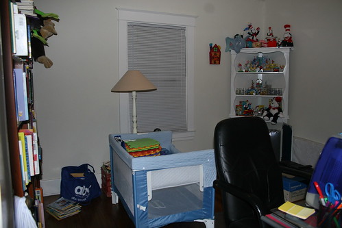
Before, when it was a messy office/dumping space:
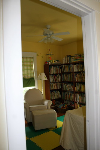
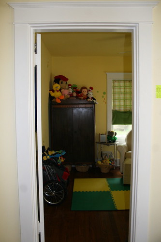
Now, looking into the room. I love the way the light comes in even with the curtains down.
C. painted the walls and ceiling (I hate white ceilings) yellow over Christmas break, we installed a ceiling fan, my mom and aunt made the curtains, and family passed down furniture (I love that they are family pieces used by other babies and kids). The dots were a complete after-thought, just something I found while online, but they probably turned out to be my favorite thing that we did.
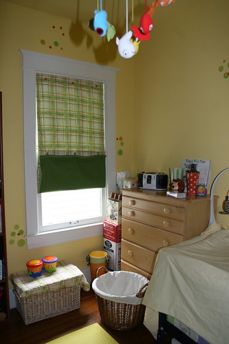
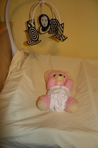
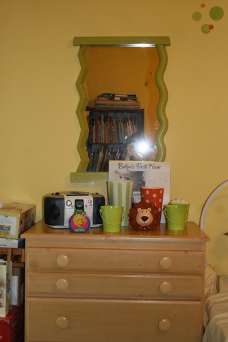
The changing table is our pack and play, set up in place of a crib for now, with my bear from when I was a baby wearing a size 0 Kissaluv cloth diaper and Proraps cover.
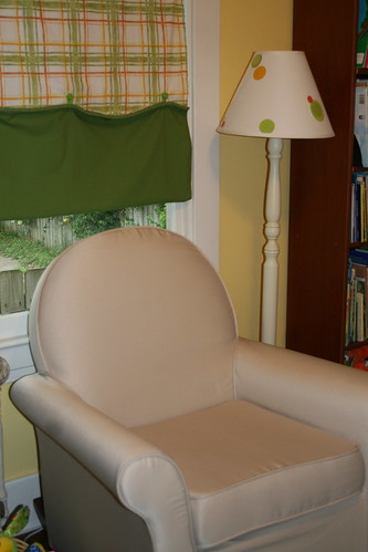
We stalked the rocker for 3 months and had given up when it fell into our laps one day after a particularly rough OB appointment, so we knew it was meant to be ours. We named it Baby Chairry--it looks just like the smaller version from Pee-Wee's Playhouse. If only it were green...
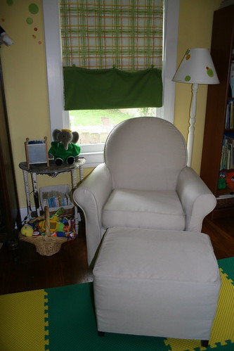
C. picked out the floors mats. Our whole house is hardwoods which we love, but knew we needed something warmer and softer for this room. So we looked at rugs, carpets and finally settled on these mats. I am not much of a plastic/rubber/synthetic person, but love that these are made from recycled rubber, non-toxic and can be easily washed. I am sure that will be the most important thing eventually. ;)
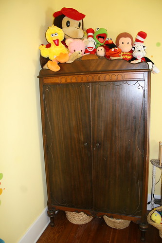
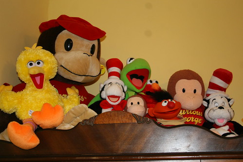
The books, stuffed animals and some of the toys we already had from teaching and collecting, so it was just natural that they go in a baby's room. A few times we saw really great themes that we loved, like Dr. Seuss murals and bedding ($425 for a quilt?! Umm, no.) and Sesame Street curtains and rugs, but always went back to the yellow and green, with a few favorites here and there.
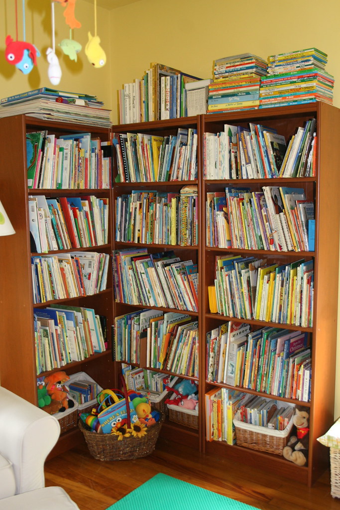
I guess our theme could be called IKEA though, completely by accident! Of course the fabric, plus the buckets and vases on the dresser, fish mobile, green mirror and several toys all came from IKEA, and there is still a wooden shelf and hooks to put up if we need them.
And eventually an IKEA crib. Two trips up there and still out of stock. We have been told they will be there in June, but others are having trouble finding any cribs in stock, right now only 2 California and one Utah store have them. Rumor in England is that they are discontinuing these models. So I am not holding my breath, but will wait it out since baby will be in a co-sleeper (the blue bed in the first picture) in our room the first few months anyway.
So what do you think? Especially the lampshade--I am not sure I like the dots on there as much as I do on the walls.
Anything look odd or missing? We still have some things to do, like put together like the swing, strip the half table, add a basket liner and get a pail for diapers. You can see more pics and some other details here: Nursery
1 comment:
Love the dots ~
Post a Comment